 SynthMock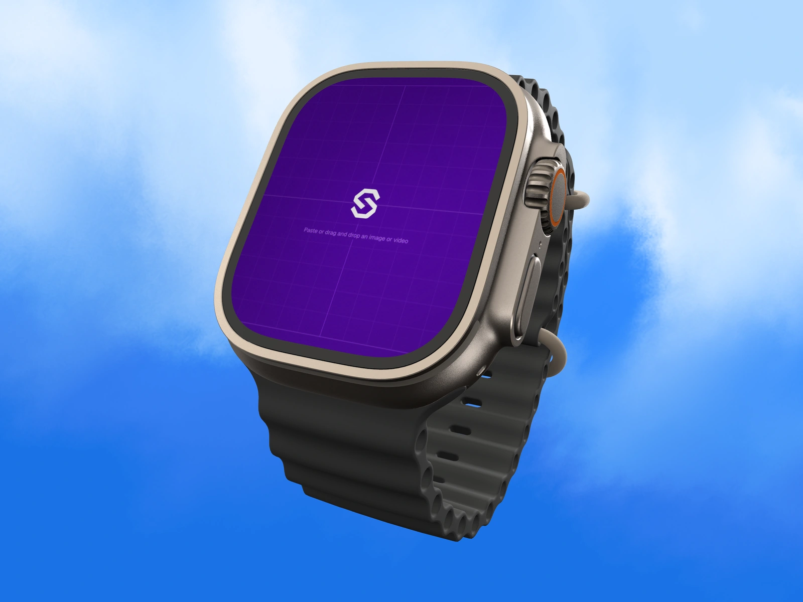
A wearable presentation has little screen area to spare. Choose one recognizable state and let the case and band establish the context without overwhelming the interface's message.
Try it in SynthMock
Bring your own screen.
Open the device in the editor and use this article alongside your own artwork.
A paid account is required to export images or videos. View plans
Choose one thing to recognize
A proposed timer interface can show the remaining time and a clear state. A scheduling interface might show the next item. Either gives a viewer something concrete to recognize without interpreting a miniature dashboard.
Use the actual supported app layout or identify a concept clearly. A large promotional number placed into a watch frame is not necessarily a plausible interface. Preserve the control relationships that explain the state, and avoid adding fabricated health or performance claims simply because the hardware is associated with activity.
Give the case and band supporting roles
In SynthMock's Apple Watch Ultra 3 scene, the band and case treatment can contribute to the palette. Keep the source's focal information separate from that styling decision.
| Element | Proposed role | Review question |
|---|---|---|
| Screen | One primary state or action | Can the viewer recognize it at the final size? |
| Case | Material definition and device context | Do highlights preserve the screen boundary? |
| Band | A supporting color and physical shape | Does it compete with the main interface accent? |
| Background | Quiet separation around the silhouette | Does the device remain clear on the final page? |
Do not confuse enlargement with usability
A close mockup can make the screen readable in a presentation, but it does not establish how the interface performs on the physical device. Use it to explain the visual state; evaluate real interaction separately when that is the question.
For a proposed campaign set, pair a whole-watch image with a closer screen view. Keep the source state and band consistent so the detail is clearly part of the same scene. Inspect reflection over the primary value or label, then review the images at normal placement size. If the small preview still requires a long explanation, simplify the selected state rather than adding more text outside the watch. The final image should communicate one useful thing well.
Final pass
Before you call it finished
- Choose one recognizable watch state.
- Keep band color supportive of the interface.
- Separate a visual presentation from real-device usability evidence.
Put the idea on a screen.
Explore device mockups ↗