 SynthMock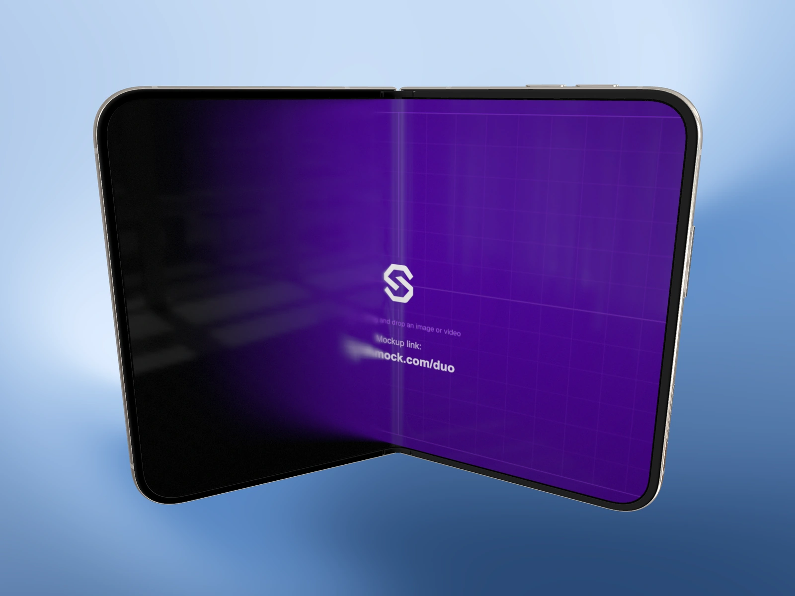
A phone can establish the setting or become the main attraction. Decide which role it plays before choosing an angle: an unfamiliar app usually needs its interface to do more explaining than its device frame.
Try it in SynthMock
Start with a Duo scene.
Use a reusable template as your starting point, then apply the choices in this article.
A paid plan is required to use templates and export.
Start with what the audience already knows
For someone who already recognizes your product, a distinctive fold or metallic edge can make a useful announcement image. The product name and existing familiarity supply context. For someone seeing the app for the first time, an attractive silhouette may reveal almost nothing about its purpose. A recognizable screen task deserves the larger share of attention.
A campaign aimed at device enthusiasts may deliberately lead with the hardware. A campaign explaining a calendar should probably show a calendar. Write that audience choice into the brief so reviewers are assessing the same objective.
Sketch two compositions before choosing
Use the same source artwork, finish and background for both roughs. That isolates the editorial choice instead of letting a more dramatic palette win the comparison. Judge the image at its intended display size, including a small social preview.
| Direction | Proposed composition | Question to answer |
|---|---|---|
| Screen-led | Open device, near-frontal view, a prominent interface area | Can someone identify the task without reading the caption? |
| Hardware-led | Partial fold, visible side profile, restrained screen detail | Does the silhouette communicate something relevant to the announcement? |
Give the supporting subject a job
In a screen-led layout, the rim, hinge and reflections can still give the image depth. Keep them as supporting cues rather than hiding all the material character. In a hardware-led layout, leave one useful part of the interface visible instead of turning both screens into an unreadable texture.
A practical paired deliverable is one open hero and one angled detail, with identical finish and palette. They can sit together in a launch gallery without forcing one image to explain everything. Avoid assigning a fixed screen-to-body percentage as a universal target: a typography-heavy app and a photo editor need different amounts of readable surface. If the rough fails at thumbnail size, change the composition before increasing export resolution.
Final pass
Before you call it finished
- Name the audience and the subject of the image.
- Compare both roughs with identical artwork and lighting.
- Keep one recognizable product cue in the supporting view.
Make the next version yours.
Explore Duo templates ↗