 SynthMock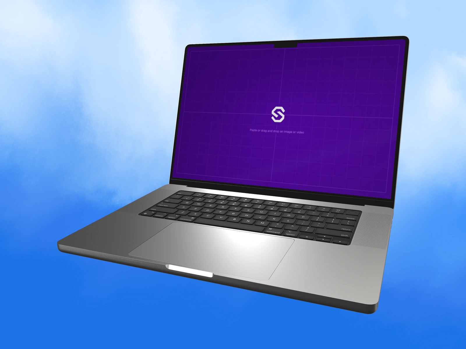
A laptop and a tablet can display similar content while suggesting different ways of working. Choose the context that helps explain your product's real task, then prepare artwork appropriate to that device.
Try it in SynthMock
Bring your own screen.
Open the device in the editor and use this article alongside your own artwork.
A paid account is required to export images or videos. View plans
Start with the work, not the hardware
A product built around writing, spreadsheets or a dense desktop workspace may be naturally explained with a laptop. A product centered on reading, sketching or a touch-oriented review may suit a tablet. Check that the chosen context matches the real product.
Use the real interface where possible. Placing a desktop screenshot inside a tablet does not establish that the product supports a useful tablet layout or touch interaction. If the work is a responsive concept, identify it as a concept and prepare separate source states rather than treating a stretched capture as a device-specific design.
Compare the context against the task
A simple decision sheet can keep the choice grounded. SynthMock offers supported MacBook and iPad models; use the specific model and its artwork guidance when producing the scene.
| Presentation task | Possible starting context | Question to verify |
|---|---|---|
| Detailed desktop workflow | MacBook with a readable screen angle | Does the source reflect the real desktop layout? |
| Focused reading or review | iPad with restrained perspective | Does the product support this orientation and layout? |
| Responsive product family | Matched laptop and tablet assets | Are both sources independently prepared and truthful? |
Let the device support the message
A laptop's keyboard and lid can establish its working context, but a low screen angle may reduce the readable interface area. A tablet offers a simpler silhouette, but that simplicity should not be used to hide input requirements the product actually has.
For a proposed comparison, keep background and lighting character consistent and give each screen a comparable role in the composition. Do not force identical camera settings on different physical forms. Judge the source at its final placement size, then choose the device that makes the intended workflow easiest to understand. If the campaign genuinely needs both contexts, create an asset family with separate sources and a shared art-direction note rather than pretending one screenshot is universal.
Final pass
Before you call it finished
- Choose hardware according to the real task and input context.
- Prepare appropriate artwork for each device.
- Label responsive concepts instead of implying verified support.
Put the idea on a screen.
Explore device mockups ↗