 SynthMock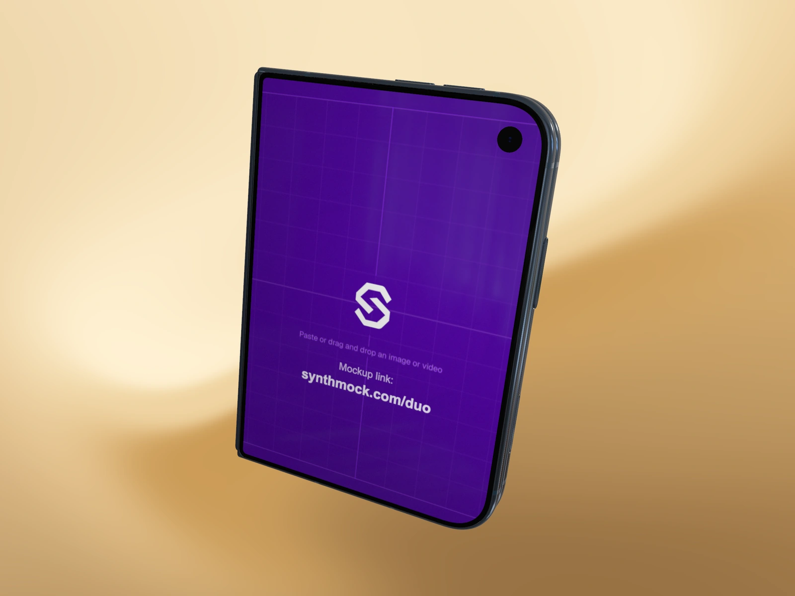
Choose the finish as part of the composition, not as a stand-in for the app's theme. The useful finish is the one that gives the device a clear silhouette and lets your interface keep the intended mood.
Try it in SynthMock
Start with a Duo scene.
Use a reusable template as your starting point, then apply the choices in this article.
A paid plan is required to use templates and export.
Judge the edge as well as the screen
Night Sky can sit quietly around a bright interface, but a dark device against a dark scene needs enough light to separate its edge. Star White can create an airy presentation, yet a pale device on a bright background may lose definition. Neither finish solves contrast on its own.
Start with the actual source screen and the intended campaign background. The app's light or dark theme does not require a matching device finish. A dark interface in a lighter body can create useful separation, while a pale interface inside a darker frame can feel deliberately contained. Compare those options with the actual screen and campaign background.
Hold everything else steady
Make two roughs from the same camera, fold and artwork. Change only the device finish first. Then, if needed, adjust light intensity to preserve material detail in each version; do not mistake a blown highlight for a better finish.
| Observe | Night Sky rough | Star White rough |
|---|---|---|
| Outer silhouette | Check dark edge separation | Check pale edge separation |
| Metal detail | Retain a controlled highlight | Retain tonal variation in bright areas |
| Interface | Keep dark UI from merging into the frame | Keep pale UI from flattening the whole scene |
Commit to one finish within the sequence
For a proposed launch set, choose one finish for the hero, square crop and motion sequence. That makes the materials a stable part of the identity while the screen tells the changing story. If the point is to show available finishes, create an explicitly labeled comparison instead of switching unexpectedly between shots.
Export a small proof from both roughs and compare them on the real page background. A standalone editor view is only part of the decision. Select the version whose boundary is clear and whose reflections support the screen. Keep the alternate scene as a deliberate variation for another campaign rather than treating it as a random change in the current one.
Final pass
Before you call it finished
- Compare finishes with the same source and camera.
- Check bright clipping and dark edge separation separately.
- Keep one finish throughout a single narrative sequence.
Make the next version yours.
Explore Duo templates ↗