 SynthMock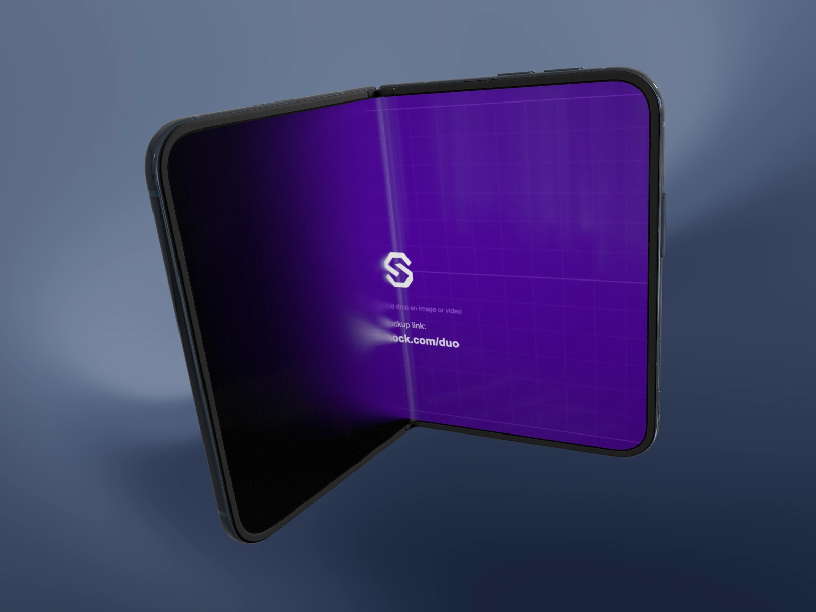
A reflection describes the shape of a surface, but it also sits on top of the screen you want people to read. Treat it as a controlled part of the composition rather than a finishing effect to maximize.
Try it in SynthMock
Start with a Duo scene.
Use a reusable template as your starting point, then apply the choices in this article.
A paid plan is required to use templates and export.
Use a highlight to explain a surface
A broad reflected source can help reveal the plane of the glass, while a narrower highlight can make the metal rim easier to distinguish. Without a useful light direction, increasing reflection may simply brighten an unhelpful area. Choose a light direction that creates a useful highlight.
In SynthMock, Reflection adjusts the screen’s reflective treatment; the studio environment and key light shape the metal body. Light direction and camera view work together. A camera turn changes where a reflection appears even if the lighting values stay fixed. That is why a finish can look convincing in one still and lose its definition during an orbit. Review the movement as a changing arrangement of surfaces rather than approving the light from one attractive frame.
A controlled study to make in your project
Keep the fold, source artwork and background unchanged. Use the comparison to decide what each lighting adjustment contributes.
| Rough | Change | Inspect |
|---|---|---|
| Baseline | Start with a restrained visible key light | Can you separate frame, glass and background? |
| Direction | Rotate the light while holding the camera | Where does the useful highlight move? |
| Reflection | Compare lower screen reflection with Reflection 1 | Does the screen retain its most important content? |
Protect the interface's important region
For a proposed analytics hero, a large white reflection over the primary metric defeats the image's purpose. Shift the light or camera so the reflection describes a quieter area. For a visual creative app, a broader glass cue may be acceptable because the artwork remains recognizable underneath.
Do not judge material quality by brightness alone. A pale surface with no tonal variation can look flat; a dark surface with no boundary can disappear. Seek a visible transition rather than an entirely white or black patch. Finish with a normal-size review of the published composition, then inspect the full motion if present. The successful balance is specific to the source interface, device finish and background you intend to use.
Final pass
Before you call it finished
- Change one lighting variable at a time in a comparison.
- Keep important interface content away from dominant reflections.
- Inspect highlights throughout any camera move.
Make the next version yours.
Explore Duo templates ↗