 SynthMock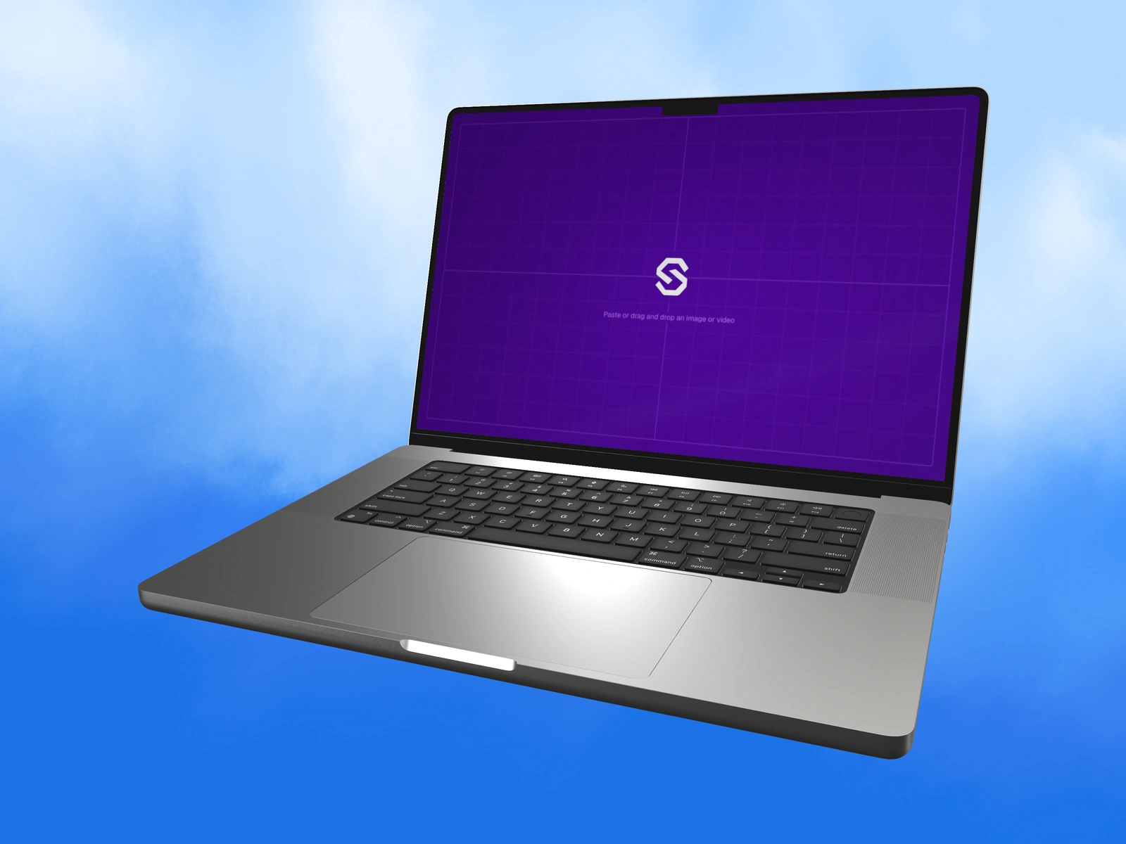
Prepare the source for the model you selected. These dimensions describe mockup artwork canvases; the final image or video can use a different aspect ratio and resolution.
Try it in SynthMock
Bring your own screen.
Open the device in the editor and use this article alongside your own artwork.
A paid account is required to export images or videos. View plans
Use the selected model’s native artwork proportions
The table lists SynthMock’s default artwork canvases in width × height. It does not replace manufacturer hardware specifications or submission requirements for an app marketplace. When a model supports orientation changes, also inspect the editor’s ideal-media guidance for the selected orientation.
| Model in SynthMock | Artwork width × height |
|---|---|
| iPhone 17 / 17 Pro / 18 Pro | 1206 × 2622 px |
| iPhone 17 Pro Max / 18 Pro Max | 1320 × 2868 px |
| iPhone Duo · cover | 1291 × 1878 px |
| iPhone Duo · inner | 2670 × 1878 px |
| MacBook Neo | 2408 × 1506 px |
| MacBook Air 13-inch | 2560 × 1664 px |
| MacBook Pro 14-inch | 3024 × 1964 px |
| MacBook Pro 16-inch / M3 16-inch | 3456 × 2234 px |
| iPad Air | 2732 × 2048 px |
| iPad Pro | 2752 × 2064 px |
| Apple Watch Ultra 3 | 1266 × 1542 px |
| Pro Display XDR | 5515 × 2884 px |
Export the source with clean boundaries
Larger images with matching proportions can preserve more available detail. Stretching an unrelated layout to fit changes the shape of text, icons and controls. Build a suitable source frame in your design file instead.
- Select the intended device before exporting the app artwork.
- Create a source frame with the corresponding proportions.
- Remove accidental outer margins, existing device borders and irrelevant desktop UI.
- Upload a supported image and inspect the entire visible screen.
- Check orientation, important edge content and text clarity before polishing lighting.
Choose final delivery dimensions afterward
The final export contains the device and background, so it does not need to match the screen canvas. A landscape laptop source can appear inside a square campaign image. A wide Duo inner source can be part of a vertical folding video.
If a final image looks soft, inspect both the source quality and how much of the canvas the device occupies. More output pixels cannot invent missing source detail or make tiny content readable at thumbnail size. Keep device-specific source files named clearly when building a campaign across several models.
Final pass
Before you call it finished
- The source matches the selected model and orientation.
- Artwork dimensions are not confused with hardware specifications.
- The final export size is chosen for its delivery context.
Put the idea on a screen.
Explore device mockups ↗